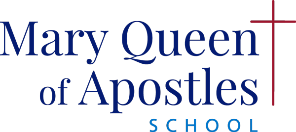
Mary Queen of Apostles
Identity Design & Rebranding
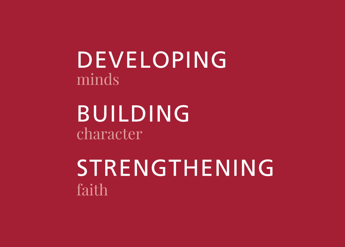
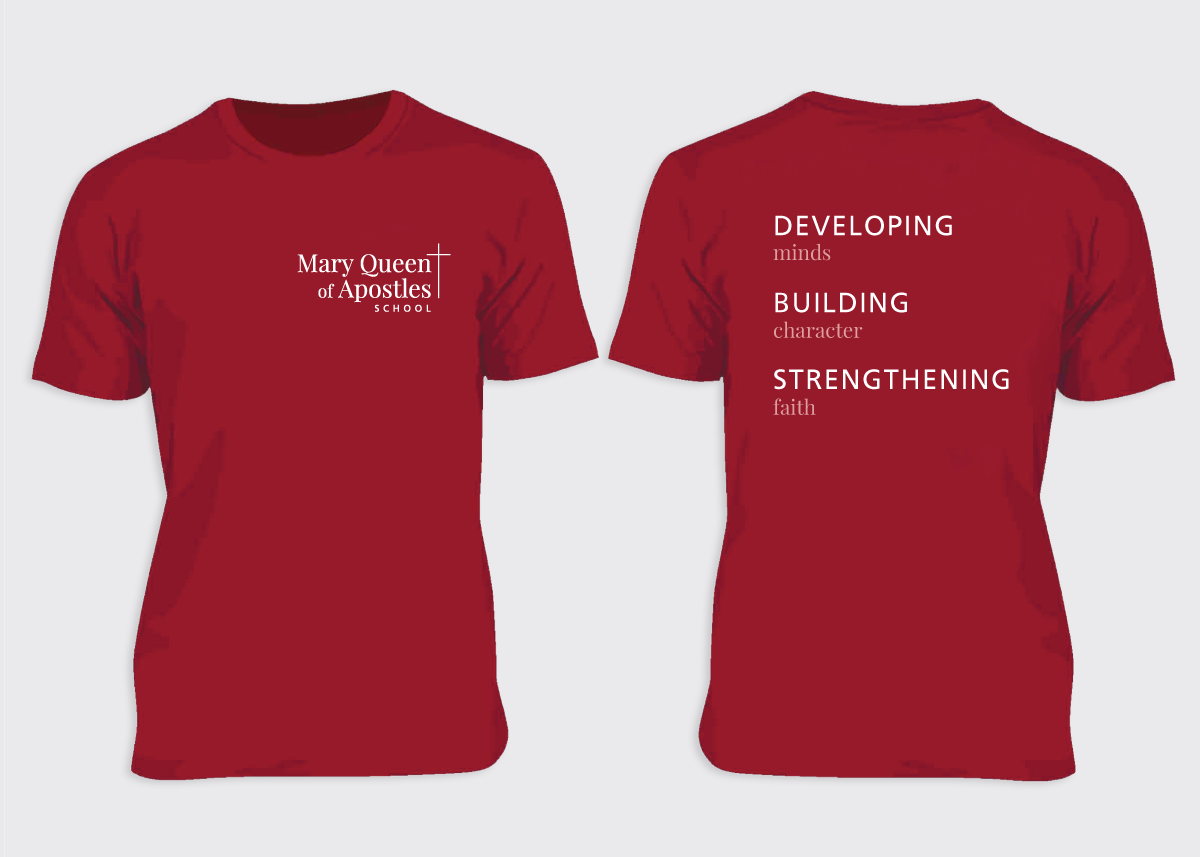
The goal of this design was to rebrand a local Catholic School that needed to increase enrollment. I led a team of designers to come up with a tagline and identity design that supported three key elements of the school — strength, character and faith. Navy blue and red were selected to match their existing color palate, and a lighter blue was paired with them to provide a more approachable appearance. The challenge was to create a simple modern logo, that could be used with and without the tagline, and applied to multiple vehicles.